00:00
00:00
serenekitchen

Female

Joined on 11/14/09

Level:
2
Exp Points:
45 / 50
Exp Rank:
> 100,000
Vote Power:
2.69 votes
Rank:
Civilian
Global Rank:
> 100,000
Blams:
0
Saves:
12
B/P Bonus:
0%
Whistle:
Normal
Medals:
45

serenekitchen's News

Posted by serenekitchen - January 1st, 2013


hey guys! i hope that your new years was an epic one! being in melbourne, or australia in particular, everyone loves to party so in my city which is the city of melbourne they really invest a lot of time in free events. In order to make sure that the crowds were more spread out, they held some of the nye events at the city parks and i have to say, GREATEST IDEA EVER!!! Felt like a hippie at a forest rave welcoming the return of the fairy queen or something on those lines!

Anyway i got some art coming up real soon, worked real hard on it and i may fuck it up last minute with my "hmmm i wonder what would happen if i did....oh yeah that ruined it" but that's ok! I also started this thing called Melbourne Weirdos of the day, its just funny sketches of people who really just don't give a damn. Check it out on my Tumblr if you are interested. Much Love xoxo

Serene

Happy 2013 Newgroundians!


Posted by serenekitchen - October 24th, 2012


Zombies everywhere! crazy makeup and rotting teeth! WALKING DEAD SEASON 3 EPICNESSSSSS!

I took part in the melbourne zombie shuffle last year and was looking forward to this year's. This time my costume is gonna be a zombie sugarskull, a slightly more creative idea and in tune with the recent boom of mexican inspired restaurants, bars, shops and trucks that are popping up like mushrooms. What are you guys gonna be? i just like the idea that i can pop into a restaurant later in my outfit and order some pork intenstines (yes it is a proper dish in chinese restaurants) and chicken feet. Anyway here are some of my cheap tricks for any of you who wants to be a zombie but is budget tight:

1. Use eyelash glue, avaliable at the local daiso or 2 dollar korean supermarket to create breaking skin and wounds. Apply, let it dry, put some powder on it and tear it up!

2. Use your old mom's/gf red lipstick for awesome red paint

3. To remove the makeup at the end of the day, use virgin olive oil!

For you zombie fanatics, check out www.irlshooter.com . It gives you a chance to kill zombies in real life if you don't get infected first hahaha.

Cheers,
Serene


Posted by serenekitchen - September 28th, 2012


I think the best thing about being in the southern hemisphere is that spring comes in september! all that heavy winter coats and thick blankets get to go into the closet and out comes the bad shorts and jesus sandals.

The activities that i have or would like to do:
1. take pictures of wild baby animals
2. get sunburnt
3. cliff diving
4. Roof top drinking
5. cycling in a bikini

Speaking of lack of clothing, i've submitted my first threadless design, i don't expect it to get chosen or a high score but if you guys have the time have a look, leave a comment or enjoy the criticism!

Click click

awesome!


Posted by serenekitchen - September 12th, 2012


Hey guys!

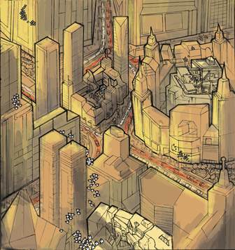
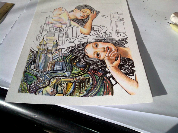
Here is the progress work for atzec cities. Its done in photoshop which me trying to mimic colour penciling using a default brush. I like the result but damn it took a while to get use to using a small point to get the effect, my usual self would have just said "fuck it" and fill it with paint bucket (although i think that is what is going to happen later when i start filling up the rest).

This colouring was done on my new diy standing desk. I'm not too sure what to make of it, my legs feel super sore but on the plus side no more backache from sitting down too long. Do any of you guys have a standing desk or do you think its stupid?

Art in progress 2


Posted by serenekitchen - August 22nd, 2012


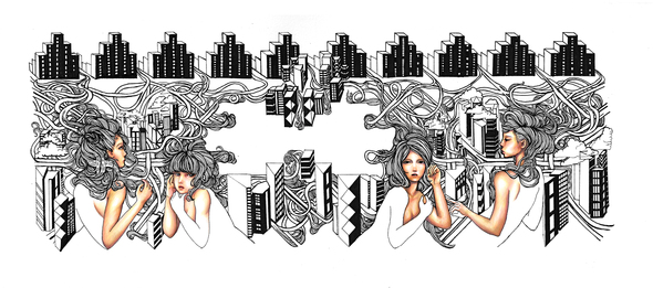
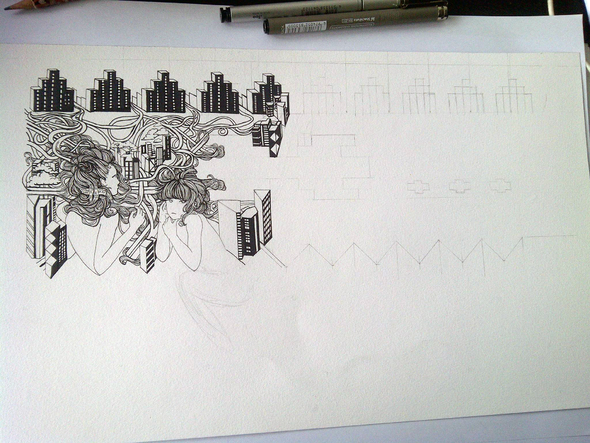
Just a short post to show you guys what i'm working on at the moment

Art in progress!


Posted by serenekitchen - August 9th, 2012


Hey guys,

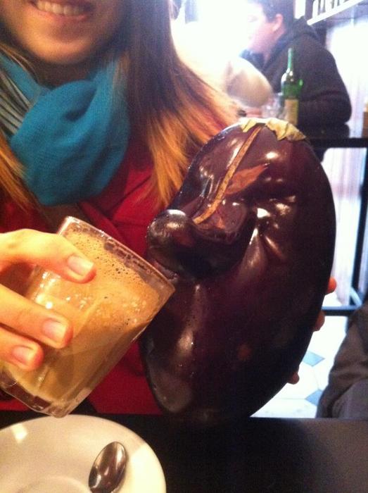
I just finished redoing my website,serenekitchen.tumblr.com and i would love to hear some feedback. Its a basic tumblr artist page and i didn't want it to have the same old white background with some cool logo on the left hand corner, coz you know, i suck at doing logos or graphic design doo doo. Yeah, nothing much to say i guess except that this time around i focused on compatibility and simplicity. I Do think that i'll design a small flash component for this. Thank you in advance and as a present for your efforts, here is a picture of an eggplant drinking coffee.

Update: I have just added an online etsy store to the website too, please add me to your circle if you have an etsy account :)

New Layout for My portfolio website


Posted by serenekitchen - August 1st, 2012


The next illustration that i'm working on is City Island Aztec print. Tribal prints are all the rage now in fast fashion and while i'm not the biggest fashion victim I really liked it because of the crazy colours they use. The challenge this time around is to use 3 different "mediums" to create the patterns i.e. buildings, roads and giant human parts. Being a geek at heart, i read up on urban ecology and gave more light into the actual "Island" effect of a city. Did you know that buildings can create microclimates that change from one location to the other? Why is it that the street parallel to the main street always have gale winds up-skirting unsuspecting g-string wearers?

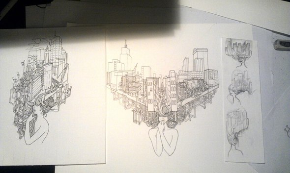
The irony behind using the aztec print is of it's exotic nature, their animal art derived from the amazing animals of south america and now used to depict the ever growing Urban environment where fauna exotics are replaced by pigeons, sparrows and feral cats. I should leave you guys with my first draft for island cities and hope that it stirs your curiousity to discover the secrets deep within

Thoughts behind Urban Islands


Posted by serenekitchen - July 24th, 2012


Threadless tees was all the rage with my t-shirt loving friends but i didn't caught on to it until this year...when i started wearing more tshirts and pants because i live with a bunch of guys and was cycling more. As an illustrator/artist, doing art is something that you have to do to stay sane but at the same time, its pretty hard to make money from it unless you are extremely good. So here i am at threadless tees at Submit a design section, seems pretty promising with 2000 dollars! (american? australian? rupees?) if your work gets chosen. I don't know about you guys but if 5 pieces of your work gets chosen, its pretty sucessful and you would't have to eat bowls of plain rice for a while you know?

Still it sounds too good to be true, the competition MUST be ridiculous and what are the chances of being selected with a few of your "best"works?? Have any of you newgroundians applied and have succeeded? I would love to hear and see your works that were chosen or were submitted and whether you fellow artists think it is a good idea! Anyway, its pretty awesome to have companies like these using work, symbiosis yo!


Posted by serenekitchen - July 18th, 2012


After learning how to ride a motorbike and being more of a regular urban cyclist, i started noticing how architecture and urban planning plays a big part in discovery of new spaces in the urban environment also the lack of new self discovery. In a way, isn't this the start of a city getting lost in a city not because it is hidden but because we do not recognize it as important. I wanted to do a map of the world where onomatopeia existed but it just got lost as another major city. It had to show that it was being isolated even when its not. This is my conclusion in progress

Urban Sprawling work in progress


Posted by serenekitchen - August 22nd, 2011


When getting into a competitive industry with all odds against you and many rejections to get through, the best thing i feel is to set mini goals and achieve them each day i.e. Something that will make you feel that you haven't wasted a day idling with colour palates, doodles and web-based procrastination.

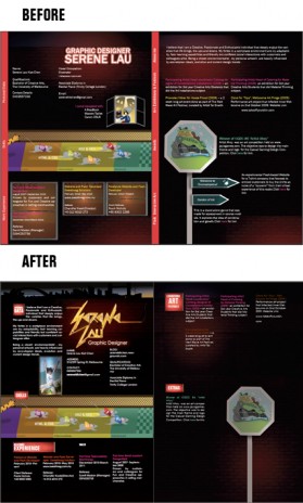
My Task was to discover what i could do to improve my creative resume. Being an artist, i believe that it is always easier to "draw" your way to success because Hey! it has worked before! But now you are in a different ball park( lol, i'm so americanized) where you have to impress seasoned Artists and Designers in their tight jeans and coffees. For once, you can't really rely on your gut instinct to seal the deal all the way. My first attempt was successful at capturing my childish/warm character without any regard about spacing, margins and prioritizing content. Naively i thought that it would definitely stand out in a sea of applicants but it finally dawn to me how difficult it was going to be.

I needed to be ... more commercial *gasp*

Here(or below) is a before and after picture of my resume, i believe that it is a big step for me because i was actually looking at other people's work for inspiration. Yeah...I have difficulty looking at other people's work because my heart drops when i realise how amazing they are and how much they have achieved when i on the contrary have done so little. Then this starts a vicious cycle of self-criticism, procrastination and depression which finally just ends with me making further plans of being a smelly hippie with no idea what an economy is like and being at a "pay as you feel" restaurant preaching to people how THEY should be living their lives. Then i throw out the idea again as i can't live without washing my hair everyday.

So yeah, good...The current resume now has a professional clean cut shave to it with a neon name sign to show that i understand that typography is important and that i can be anal when required. It was tedious and whilst attention to detail is not my thing, self-disclipine was a strong motivator. It can also be printed too without being cut out! Overall, this is a good step in my bigger goal :)
Life is all about first impressions, sad but true!